Acknowledge: this is the translation version of my early published article "思源插件开发 Quick Start" in Chinese.
I used Gemini for translation and did a little language checks.
This article is also published at: docs.siyuan-note.club
🔔 Preliminary Remarks
-
This document is not a step-by-step plugin development tutorial.
- It is intended to provide a guide for SiYuan plugin development for developers with necessary experiences, to help them lower the barrier for plugin development.
- It assumes readers are familiar with many prerequisite technologies, therefore this article adopts a concise language style without excessive explanations.
-
This document is also not a comprehensive plugin development manual.
-
It only includes the concepts and usages that I personally consider most common.
-
For information on how to publish and update plugins, please refer to the README of the official plugin template. It will not be covered here.
-
There lacks the documentation for SiYuan plugin development (due to limited manpower). If you want to explore on your own, you can refer to:
- The d.ts declaration file provided by SiYuan.
- Examining the SiYuan source code.
- The community documentation (also not comprehensive, and the English part is barely empty).
-
START UP
The typical workflow for SiYuan plugin development is as follows:
- Create a new GitHub project using the plugin template.
- Develop locally using a Node.js environment.
- Package the project and create a GitHub release.
- Submit to the SiYuan Plugin Market.
Plugin Development Environment Dependencies
-
Node.js environment.
-
npm install siyuan- A pure TypeScript interface declaration project.
- It declares various APIs for SiYuan plugins.
- Due to the lack of plugin documentation for SiYuan, it is necessary to carefully read the internal interface definitions (d.ts file).
Use a Separate Workspace
When developing plugins, it is highly recommanded to use a separate workspace to avoid adverse effects on your own note data, due to unexpected situations encountered during plugin development.
Plugin Development Templates
Currently, there are two sets of plugin development templates provided under the official SiYuan repository:
-
- Provided by the core SiYuan developers, but not recommended.
-
SiYuan plugin sample (Vite & Svelte)
- Uses vite to package the project and has built-in support for svelte.
- 💡 Recommended.
- Provides features such as symbolic links and hot reloading; includes TypeScript type declarations and a series of utility functions; significantly improves development efficiency compared to the former.
If you don't want to use the Svelte framework, you can choose:
- frostime/plugin-sample-vite project, which removes the Svelte part while keeping the rest consistent with the Svelte template.
- frostime/plugin-sample-vite-solidjs project, based on the SolidJS framework, with other parts mostly consistent with the Svelte template.
❓ Why Svelte instead of more common frameworks like React?
- React's popularity stems mainly from its first-mover advantage and excellent ecosystem. However, in the context of plugin development, the richness of the front-end library's ecosystem and the abundance of component libraries have less impact.
- Svelte is lightweight and performs well, while React and other vDOM-based frameworks tend to have larger bundle sizes, making them less suitable for small-scale projects like plugin development.
- Svelte is mostly easy to learn.
Plugin Lifecycle
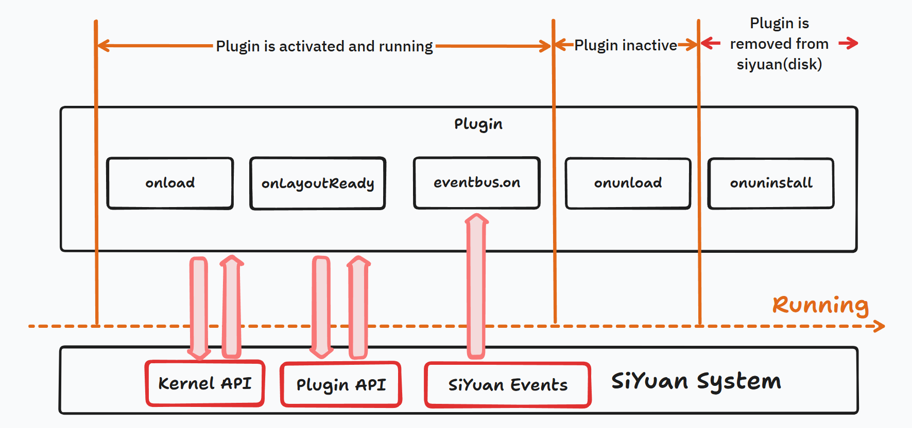
Plugin Lifecycle Hooks
import { Plugin } from 'siyuan';

class MyPlugin extends Plugin {
    onload() {
      // The plugin's entry point function. A minimal plugin must at least include the implementation of onload. Most frequently used.
      // onload can be declared as an async function.
    }

    onLayoutReady() {
      // This function is automatically called when the layout is loaded.
    }

    onunload() {
      // This function is automatically called when the plugin is disabled.
    }

    uninstall() {
      // This function is automatically called when the plugin is uninstalled.
    }
}
eventbus
There is an eventBus object in the plugin.
class Plugin {
  eventBus: EventBus;
}
You can use plugin.eventBus.on('some event', callback func) to register a callback function for a bus event, allowing the plugin to execute specific functions at specific times in SiYuan. For example:
import { Plugin } from 'siyuan';

class MyPlugin extends Plugin {
    cbBound: this.cb.bind(this);

    cb({ detail} ) {
      console.log('A new document has just been opened!');
    }

    onload() {
      this.eventBus.on('loaded-protyle-dynamic', this.cbBound);
    }

    onunload() {
      this.eventBus.off('loaded-protyle-dynamic', this.cbBound);
    }
}
For information on which events the event bus supports, please refer to the d.ts API file.
Several Important Concepts
Kernel API and Plugin API
SiYuan is based on a BS architecture, so when we talk about SiYuan's API, we need to distinguish between two different sets of APIs:
-
Kernel API: The network API exposed by SiYuan's backend, called by making network requests (such as
fetchin JavaScript,requestsin Python, etc.).-
The Kernel API is often related to data and SiYuan's underlying configuration.
-
The Kernel API can also be divided into two parts:
-
Open API:
- These APIs are explicitly defined and fixed by SiYuan and are guaranteed not to change.
- You can refer to the API documentation for detailed usage.
-
Non-Open API:
- These APIs are essentially no different from the Open API and can be freely called through network requests.
- However, these APIs are defined as "unstable APIs," meaning that developers theoretically have the right to modify them without considering the needs of third-party users.
- There is no official documentation for these APIs. If you want to use them, you can only inspect SiYuan's network requests or view the API code of SiYuan's backend and deduce the usage yourself.
- Relevant source code: https://github.com/siyuan-note/siyuan/tree/master/kernel/api
-
-
-
Plugin API: JavaScript front-end API specifically for plugins.
- Can only be used within plugins.
- Obtained through
require('siyuan')in plugin development. - For details, see the plugin API type definition interface: https://github.com/siyuan-note/petal
Protyle
Protyle is the most important concept in SiYuan. It refers to a complete SiYuan document object. The most core parts are:
- element: The front-end HTML element of the document.
- ws connection: Connected to the backend via WebSocket to read data from the SiYuan core in real time.
You can open developer mode and see that the top-level div of each document is an element with the class name protyle. This protyle represents the complete document.
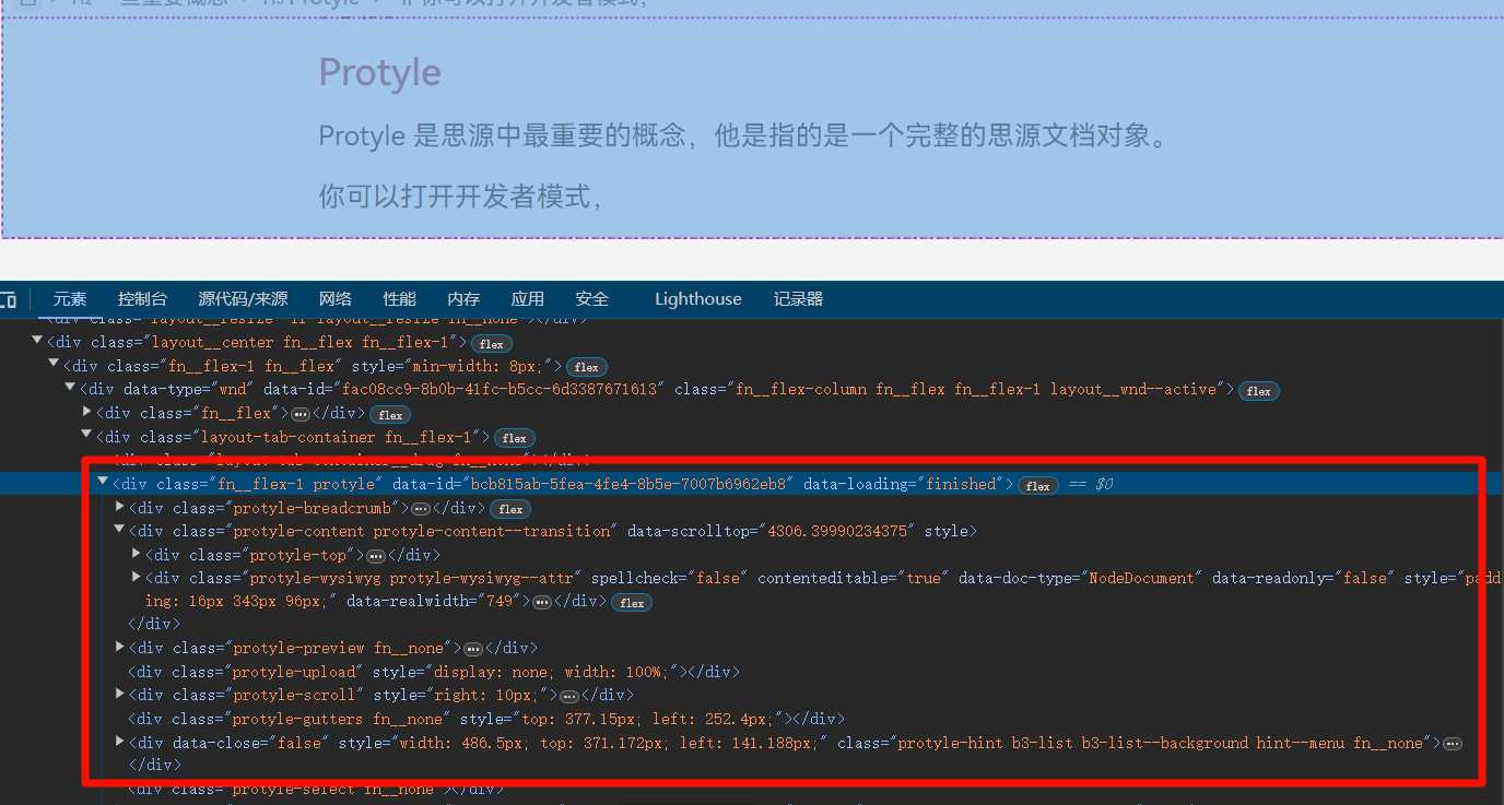
The most important components of a protyle are as follows:
-
title: The block title section of the document.
-
wysiwyg: The WYSIWYG editor (What You See Is What You Get), the core part of SiYuan.
Note: Avoid manually modifying the DOM as possible! If you want to change the document content, please use the kernel/backend API.
-
gutter: The block icon; a single element is shared within a document.
Block and Node
- Block is a concept in the SiYuan kernel, corresponding to the Block object in the SQLite database.
- Node is a front-end concept. A Block is often represented by a Node on the front end. The
wysiwygis composed of several Nodes.
The following is the element corresponding to the title block in a protyle:
<div data-subtype="h3" data-node-id="20240731174116-tu1nxd3" data-node-index="28" data-type="NodeHeading" class="h3" updated="20240731200430">
  <div contenteditable="true" spellcheck="false">Block and Node</div>
  <div class="protyle-attr" contenteditable="false"></div>
</div>
data-node-idcorresponds to the ID of the block.data-typecorresponds to the type of the block.data-subtypecorresponds to the subtype of the block.
HOWTO
This section quickly introduces common requirements encountered in SiYuan plugin development and how to implement them.
Registering a Top Bar Icon
You can call plugin.addTopbar to add a button with svg icon to the top bar for your plugin.

  /**
   * Must be executed before the synchronous function.
   * @param {string} [options.position=right]
   * @param {string} options.icon - Support svg id or svg tag.
   */
  addTopBar(options: {
      icon: string,
      title: string,
      callback: (event: MouseEvent) => void
      position?: "right" | "left"
  }): HTMLElement;
The most common practice in SiYuan is:
- Register a top bar button for the plugin.
- When the button is clicked, display a Context Menu to trigger more functions (see the following sections for details).
Using Icons
-
In many APIs of SiYuan plugins, there will be an
iconparameter. -
This parameter needs to be passed the name of an svg symbol, for example, we can pass a parameter named
iconRight. And this input will be filled into a svg element like this:<svg class="b3-menu__icon b3-menu__icon--small"> <use xlink:href="#iconRight"></use> </svg> -
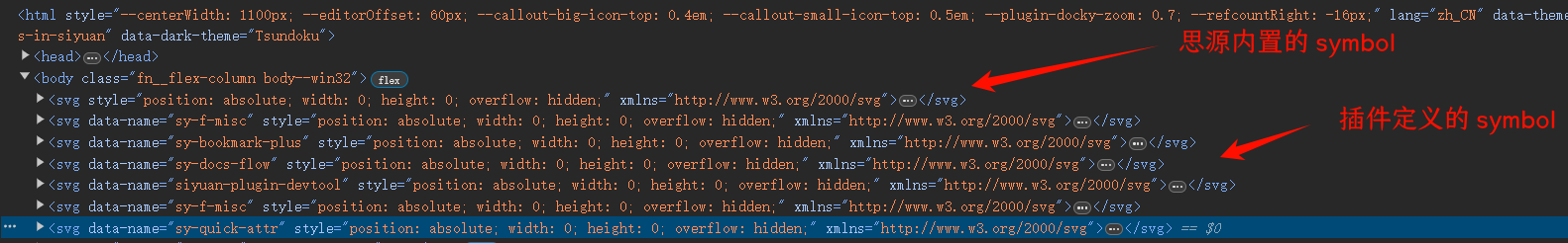
You can find all built-in
symboldefinitions in SiYuan underbody>svg>defs. -
You can call
plugin.addIconsto pass in custom SVG symbols, for example:plugin.addIcons(` <symbol id="iconUrl" viewBox="0 0 1024 1024"> <path d="M578.133 675.627c-3.306-3.307-8.746-3.307-12.053 0L442.133 799.573c-57.386 57.387-154.24 63.467-217.6 0-63.466-63.466-57.386-160.213 0-217.6L348.48 458.027c3.307-3.307 3.307-8.747 0-12.054l-42.453-42.453c-3.307-3.307-8.747-3.307-12.054 0L170.027 527.467c-90.24 90.24-90.24 236.266 0 326.4s236.266 90.24 326.4 0L620.373 729.92c3.307-3.307 3.307-8.747 0-12.053l-42.24-42.24z m275.84-505.6c-90.24-90.24-236.266-90.24-326.4 0L403.52 293.973c-3.307 3.307-3.307 8.747 0 12.054l42.347 42.346c3.306 3.307 8.746 3.307 12.053 0l123.947-123.946c57.386-57.387 154.24-63.467 217.6 0 63.466 63.466 57.386 160.213 0 217.6L675.52 565.973c-3.307 3.307-3.307 8.747 0 12.054l42.453 42.453c3.307 3.307 8.747 3.307 12.054 0l123.946-123.947c90.134-90.24 90.134-236.266 0-326.506z"></path><path d="M616.64 362.987c-3.307-3.307-8.747-3.307-12.053 0l-241.6 241.493c-3.307 3.307-3.307 8.747 0 12.053l42.24 42.24c3.306 3.307 8.746 3.307 12.053 0L658.773 417.28c3.307-3.307 3.307-8.747 0-12.053l-42.133-42.24z"></path> </symbol> `);
You can see all the symbol definitions in developer mode.
Here provides a manual way to create a custom symbol.
-
Find an SVG icon you prefer (e.g., on https://www.svgrepo.com/, www.iconfont.cn/ etc.).
-
Download it and modify the SVG string:
- Change the SVG tag name to
symbol. (<svg>...</svg>to<symbol>...</symbol>) - Remove attributes related to fixed colors and sizes from the SVG (so as to fit with the theme color in SiYuan).
- Change the SVG tag name to
Opening a Menu
Menu is the most commonly used user interface in SiYuan.
Creating/opening a menu via a plugin requires three steps:
- Create a menu object using
new Menu. - Add menu items using
menu.addItem. - Display the menu using
menu.open.
For example, here's an example of displaying a menu:
import { Menu } from 'siyuan';

private addMenu() {
    const menu = new Menu("myPluginMenu", () => {
        console.log("Menu will close");
    });
    menu.addItem({
        icon: "iconInfo",
        label: "About",
        click: () => {
            // Callback for the menu item
        }
    });
    menu.open({ x: 0, y: 0 }); // Display the menu
}
For specific parameters of addItem, refer to IMenuItemOption in the plugin types.
export interface IMenuItemOption {
    iconClass?: string;
    label?: string;
    click?: (element: HTMLElement, event: MouseEvent) => boolean | void | Promise<boolean | void>;
    type?: "separator" | "submenu" | "readonly";
    accelerator?: string;
    action?: string;
    id?: string;
    submenu?: IMenuItemOption[];
    disabled?: boolean;
    icon?: string;
    iconHTML?: string;
    current?: boolean;
    bind?: (element: HTMLElement) => void;
    index?: number;
    element?: HTMLElement; //Note that you can choose to use a custom element rather than the default ones
}
Registering a Block Menu
Block menu pops up when you click the gutter button.
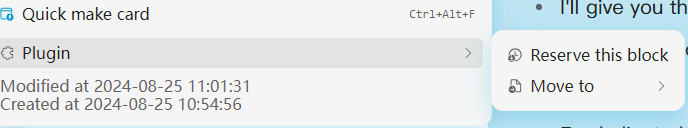
It is essentially a normal menu, but the menu variable is offerted through the eventBus, on the click-blockicon event.
The following example refers to sy-bq-callout/index.ts:
export default class BqCalloutPlugin extends Plugin {

    private blockIconEventBindThis = this.blockIconEvent.bind(this);

    async onload() {
        this.eventBus.on("click-blockicon", this.blockIconEventBindThis);
    }

    async onunload() {
        this.eventBus.off("click-blockicon", this.blockIconEventBindThis);
    }

    private blockIconEvent({ detail }: any) {
        //  Please refer to the type definition of the click-blockicon eventBus.
        // Here the event detail offers the menu object
        let menu: Menu = detail.menu;
        let submenus = [];
        submenus.push({
            element: callout.createCalloutButton("", {id: this.i18n.mode.big, icon: '🇹'}),
            click: () => {
                setBlockAttrs(ele.getAttribute("data-node-id"), {
                    'custom-callout-mode': 'big',
                });
            }
        });
        submenus.push({
            element: callout.createCalloutButton("", {id: this.i18n.mode.small, icon: '🇵'}),
            click: () => {
                setBlockAttrs(ele.getAttribute("data-node-id"), {
                    'custom-callout-mode': 'small',
                });
            }
        });
        menu.addItem({
            icon: "iconInfo",
            label: this.i18n.name,
            type: "submenu",
            submenu: submenus
        });
    }

}
📝 Note: The document block menu and the block menu within the editor are not together but are separate events. (Because the document title icon is not a gutter element)
this.eventBus.on('click-editortitleicon', this.blockIconEventBindThis);
Opening a Dialog
To create/open a dialog box through a plugin, you need to call the Dialog object, like this:
const dialog = new Dialog({
    title: "Hello",
    content: "This is a dialog",
    width: "500px",
    // Other configurations...
});
Dialog is a class that automatically opens upon creation, without the need to call any open method. While it has a destroy method to manually close the dialog.
The most important parameter in creating a Dialog is content, which is a string representing the inner content of the dialog. The easiest usage is to pass a plain text into the dialog and serve it as a message box.
However, you can also pass in an HTML string. For example, the following case (refer to plugin-sample-vite-svelte/src/libs/dialog.ts):
export const inputDialog = (args: {
    title: string, placeholder?: string, defaultText?: string,
    confirm?: (text: string) => void, cancel?: () => void,
    width?: string, height?: string
}) => {
    const dialog = new Dialog({
        title: args.title,
        content: `<div class="b3-dialog__content">
    <div class="ft__breakword"><textarea class="b3-text-field fn__block" style="height: 100%;" placeholder=${args?.placeholder ?? ''}>${args?.defaultText ?? ''}</textarea></div>
</div>
<div class="b3-dialog__action">
    <button class="b3-button b3-button--cancel">${window.siyuan.languages.cancel}</button><div class="fn__space"></div>
    <button class="b3-button b3-button--text" id="confirmDialogConfirmBtn">${window.siyuan.languages.confirm}</button>
</div>`,
        width: args.width ?? "520px",
        height: args.height
    });
    const target: HTMLTextAreaElement = dialog.element.querySelector(".b3-dialog__content>div.ft__breakword>textarea");
    const btnsElement = dialog.element.querySelectorAll(".b3-button");
    btnsElement[0].addEventListener("click", () => {
        if (args?.cancel) {
            args.cancel();
        }
        dialog.destroy();
    });
    btnsElement[1].addEventListener("click", () => {
        if (args?.confirm) {
            args.confirm(target.value);
        }
        dialog.destroy();
    });
};
It's obviously tedious to pass in HTML strings directly every time. For convenience, we can use the element property of the dialog object, which represents the HTMLElement of the Dialog object itself and encapsulate the Dialog to accept an incoming Element:
// Refer to https://github.com/siyuan-note/plugin-sample-vite-svelte/blob/main/src/libs/dialog.ts
export const simpleDialog = (args: {
    title: string, ele: HTMLElement | DocumentFragment,
    width?: string, height?: string,
    callback?: () => void;
}) => {
    const dialog = new Dialog({
        title: args.title,
        content: `<div class="dialog-content" style="display: flex; height: 100%;"/>`,
        width: args.width,
        height: args.height,
        destroyCallback: args.callback
    });
    dialog.element.querySelector(".dialog-content").appendChild(args.ele);
    return dialog;
}
Opening a Document Page
-
Open a block ID in a tab on the desktop:
import { openTab } from 'siyuan'; openTab({ app: plugin.app, // plugin is the 'this' object of your plugin doc: { id: "Document or block ID" } }); -
Opening a block document on mobile requires a different API (mobile doesn't have page tabs):
openMobileFileById(plugin.app, blockId)
In addition, another option is to use the siyuan:// link. For example, you can create it like this:
const url = `siyuan://blocks/20240731174116-23lqdzi`;
window.open(url)
However, this approach is not recommended.
Opening a Custom Tab
A Tab is a center page which can be either a document or a custom page.
In the previous section, we've showed how to use openTab to open a document. If you want to open a custom tab, you can refer to the following use case (refer to sy-test-template/index.ts).
-
Create a Tab object using
addTab:typeparameter: Pass in the unique identifier of the Tab.- Initialize the internal DOM in the
initfunction.
-
Open the tab using
openTab. For custom tabs created by plugins, the ID is<Plugin Name> + <Type Name>.
import {
    Plugin,
    openTab
} from "siyuan";
import "@/index.scss";
import { createElement } from "./func";


export default class PluginTestTemplate extends Plugin {

    openTab() {
        const id = Math.random().toString(36).substring(7);
        this.addTab({
            'type': id,
            init() {
                //Note: as we use this.element to visit the element of the tab object
                //You'd better not to used a arrow function as it will make `this` lost
                this.element.style.display = 'flex';
                this.element.appendChild(createElement());
            }
        });
        openTab({
            app: this.app,
            custom: {
                title: 'TestTemplate',
                icon: 'iconMarkdown',
                id: this.name + id,
            }
        });
    }

}
Determining the Plugin's Running Environment
The plugin specifies the allowed running environments in plugin.json.
{
  "backends": [
    "windows",
    "linux",
    "darwin",
    "docker",
    "ios",
    "android"
  ],
  "frontends": [
    "desktop",
    "mobile",
    "browser-desktop",
    "browser-mobile",
    "desktop-window"
  ],
}
SiYuan's API also provides functionality to get the current running environment.
function getFrontend(): "desktop" | "desktop-window" | "mobile" | "browser-desktop" | "browser-mobile";
function getBackend(): "windows" | "linux" | "darwin" | "docker" | "android" | "ios";
The most common practice is to use getFrontend to determine if it is a mobile environment, as many DOM structures in the mobile environment are different from the desktop environment (most frequently met: there is no tab in mobile) and require separate adaptation by the plugin (e.g., using openMobileFileById to open a document). Here is the case (refer to sy-bookmark-plus):
//utils.ts
import { getFrontend } from 'siyuan';

export const isMobile = () => {
    return getFrontend().endsWith('mobile');
}

//components/item.tsx
import { isMobile } from "@/utils";

const openBlock = () => {
    if (isMobile()) {
        openMobileFileById(plugin.app, item().id);
    } else {
        openTab({
            app: plugin.app,
            doc: {
                id: item().id,
                zoomIn: item().type === 'd' ? false : true,
            },
        });
    }
};
Using Front-End Frameworks
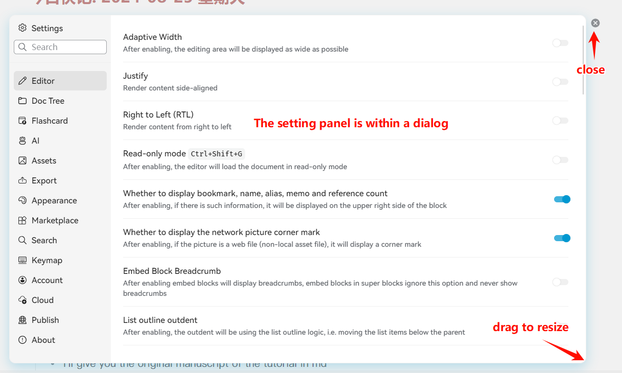
When you need to use a front-end framework (svelte, vue, solidjs, react etc.) within Dialogs, Tabs, etc., you can use the framework's own rendering function to bind components to Elements in the page. Here is a simple example, where SettingExample is a Svelte component, and we display this component in a Dialog.
import SettingExample from "@/setting-example.svelte";

let dialog = new Dialog({
    title: "SettingPannel",
    content: `<div id="SettingPanel" style="height: 100%;"></div>`,
    width: "800px",
    destroyCallback: (options) => {
        console.log("destroyCallback", options);
        // You'd better destroy the component when the dialog is closed
        pannel.$destroy();
    }
});
let pannel = new SettingExample({
    target: dialog.element.querySelector("#SettingPanel"),
});
Another example, for the Vue framework:
// Refer to: siyuan-plugin-picture-library
import Tab from './components/tab.vue';

this.addTab({
  type: TAB_TYPE,
  init() {
    const tab = createApp(Tab);
    tab.use(ElementPlus);
    tab.provide('plugin', plugin);
    tab.provide('folder', this.data);
    tab.mount(this.element);
  }
})
⚠️ Important Note: When using front-end frameworks, be careful to avoid memory leaks.
The destruction of SiYuan's Dialog or Tab is an external script behavior for the front-end framework and does not involve the component's lifecycle. Therefore, when a Dialog is destroyed, it will not trigger the onUnMount (onDestroy, onCleanup, the names vary in different frameworks) hook in the component.
Therefore, if you create any side effects in the front-end framework that need to be destroyed in the cleanup hook (e.g., clearInterval), it is recommended to manually call the destruction method in the Dialog's destroyCallback to trigger the component's cleanup lifecycle.
For more information, refer to: https://ld246.com/article/1721278971170
Plugin Settings
Data
Plugins can use plugin.saveData and plugin.loadData to write/read configuration files.
const File = 'config.json';
const DefaultConfig = {
  refresh: true,
  title: 'hello'
}

export default class PluginSample extends Plugin {

    async onload() {
        // Read
        let data = await this.loadData(File);
        data = data ?? DefaultConfig;

        // Save
        this.saveData(File, data);
    }

}
Plugin data will be saved under data/petal/<name>/.
UI
There are generally two approaches/three methods to create a user-interactive settings panel in SiYuan plugins:
-
Implementing the
settingobject:- Using the built-in
plugin.setting. - Using the
SettingUtilsprovided by the plugin template.
- Using the built-in
-
Implementing the
openSettingmethod:- Using a custom Setting component.
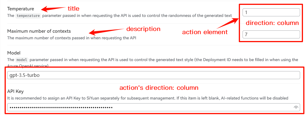
The plugin.setting object is a special tool provided by SiYuan that helps developers create a Setting panel.
The most important method is createActionElement.
import { Setting } from 'siyuan';

this.setting = new Setting({
    confirmCallback: () => {
        this.saveData(STORAGE_NAME, {readonlyText: textareaElement.value});
    }
});
this.setting.addItem({
    title: "Readonly text",
    direction: "row",
    description: "Open plugin url in browser",
    createActionElement: () => {
        textareaElement.className = "b3-text-field fn__block";
        textareaElement.placeholder = "Readonly text in the menu";
        textareaElement.value = this.data[STORAGE_NAME].readonlyText;
        return textareaElement;
    },
});
As you can see, using plugin.setting is a bit cumbersome. You need to write your own createActionElement and handle loadData and saveData separately. Therefore, it is recommended to use the SettingUtils tool provided by the plugin template (plugin-sample-vite-svelte/libs/setting-utils.ts).
import { SettingUtils } from "./libs/setting-utils";

export default class PluginSample extends Plugin {

    customTab: () => IModel;
    private isMobile: boolean;
    private blockIconEventBindThis = this.blockIconEvent.bind(this);
    private settingUtils: SettingUtils;

    async onload() {
        this.settingUtils = new SettingUtils({
            plugin: this, name: STORAGE_NAME
        });
        /*
          The action element type is automatically specified by the 'type'; 'value' serves as the default value.
        */
        this.settingUtils.addItem({
            key: "Input",
            value: "",
            type: "textinput",
            title: "Readonly text",
            description: "Input description",
            action: {
                // Called when focus is lost and content changes
                callback: () => {
                }
            }
        });
        this.settingUtils.addItem({
            key: "Select",
            value: 1,
            type: "select",
            title: "Select",
            description: "Select description",
            options: {
                1: "Option 1",
                2: "Option 2"
            },
            action: {
                callback: () => {
                }
            }
        });

        await this.settingUtils.load(); // Import and merge configurations
    }
}
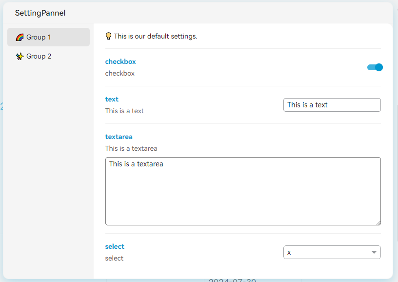
However, SettingUtils only provides a single-panel settings interface (i.e. not multi-tabs panel, like the official setting dialog in SiYuan), and customizing setting elements is relatively troublesome. Therefore, if you are using a front-end framework, it is more recommended to write your own configuration panel, which requires overriding the openSetting method.
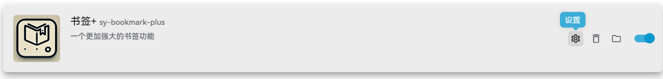
When you click the "Settings" button of the plugin, the plugin.openSetting method will be automatically called.
So, you can implement the openSetting method yourself and open a custom setting interface like this:
import SettingExample from "@/setting-example.svelte";

openSetting(): void {
    let dialog = new Dialog({
        title: "SettingPannel",
        content: `<div id="SettingPanel" style="height: 100%;"></div>`,
        width: "800px",
        destroyCallback: (options) => {
            console.log("destroyCallback", options);
            //You'd better destroy the component when the dialog is closed
            pannel.$destroy();
        }
    });
    let pannel = new SettingExample({
        target: dialog.element.querySelector("#SettingPanel"),
    });
}
If you are using the plugin-sample-vite-svelte plugin template, it provides a multi-tabs example: src/setting-example.svelte.
Potential Issues Regarding Syncing Settings
Below are some issues (🐛) that may be triggered during synchronization. Due to the unstable nature of these bugs, I merely list them here as a reference for developers during debugging.
-
Issues with simultaneous multi-device operations:
Consider a scenario where Device A and Device B are running simultaneously.
When we update the configuration in Device A and write the new
configs.json, the file will be synchronized to Device B through the cloud.However, since Device B is also running. Thought the plugin's configuration file is updated, the plugin on Device B in runtime is unaware of this changes.
If the user updates the settings on Device B at the same time, the
configs.jsonon Device B will overwrite the results of the previous synchronization. -
Conflicts caused by writing new configurations before synchronization:
Assume that at time T, SiYuan is started, and the plugin is also started.
After SiYuan starts, it automatically fetches the latest data from the cloud and pulls it locally.
Supposing that the plugin updates the local configuration file in the
onloadfunction at time T + 1, and SiYuan starts updating the relevant cloud data at time T + 2. During the merge, it will mistakenly believe that the local file is the latest, thereby discarding the data transmitted from the cloud.
Registering a Dock Sidebar
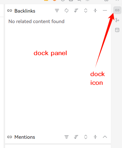
Use the plugin.addDock API:
- config: Configure the position, size, title, etc., of the sidebar.
- data: Pass in an object. The object passed in can be directly accessed by
thiswithin theinitAPI. - init: Initialization function; here you can access the sidebar's element through
thisto set the internal elements (so don't use arrow functions for the callback).
Refer to sy-bookmark-plus/src/index.ts for the following example:
this.addDock({
    type: '::dock',
    config: {
        position: 'RightBottom',
        size: {
            width: 200,
            height: 200,
        },
        icon: 'iconBookmark',
        title: 'Bookmark+'
    },
    data: {
        plugin: this,
        initBookmark: initBookmark,
    },
    init() {
        this.data.initBookmark(this.element, this.data.plugin);
    }
});
Registering Keyboard Shortcuts
You can register a keyboard shortcut operation through plugin.addCommand.
this.addCommand({
    langKey: "showDialog",
    hotkey: "⇧⌘O",
    callback: () => {
        this.showDialog();
    },
    fileTreeCallback: (file: any) => {
        console.log(file, "fileTreeCallback");
    },
    editorCallback: (protyle: any) => {
        console.log(protyle, "editorCallback");
    },
    dockCallback: (element: HTMLElement) => {
        console.log(element, "dockCallback");
    },
});
The most crucial aspects here are hotkey and the callback method. The hotkey must be set in a specific order to take effect.
export interface ICommandOption {
    langKey: string // Key used to distinguish different shortcuts
    langText?: string // Description text for the shortcut function
    /**
     * Currently, macOS symbols is applied; Please order the symbol as ⌥⇧⌘; e.g., ⌥⇧⌘A
     * "Ctrl": "⌘",
     * "Shift": "⇧",
     * "Alt": "⌥",
     * "Tab": "⇥",
     * "Backspace": "⌫",
     * "Delete": "⌦",
     * "Enter": "↩",
     */
    hotkey: string,
    customHotkey?: string,
    callback?: () => void // Will not be triggered if other callbacks exist
    globalCallback?: () => void // Callback executed when the focus is not within the application
    fileTreeCallback?: (file: any) => void // Callback executed when the focus is on the file tree
    editorCallback?: (protyle: any) => void // Callback executed when the focus is on the editor
    dockCallback?: (element: HTMLElement) => void // Callback executed when the focus is on the dock
}
All the hotkey configurations can be found under siyuan.config.keymap.
The hotkey registered by the plugin is stored in default attribute, while the custom attribute can be set by users in Setting panel.
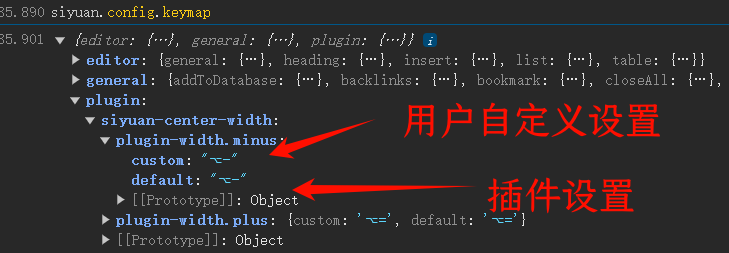
If you want to programatically override SiYuan's built-in hotkeys, you can leave the custom field of the hotkey configuration empty; when restoring, fill it back in from default.
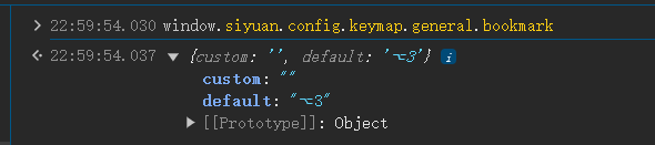
The following example refers to the Bookmark+ plugin:
const bookmarkKeymap = window.siyuan.config.keymap.general.bookmark;

// Disable the default bookmark shortcut
bookmarkKeymap.custom = '';

// Restore the shortcut
bookmarkKeymap.custom = bookmarkKeymap.default;
Registering "/" Commands
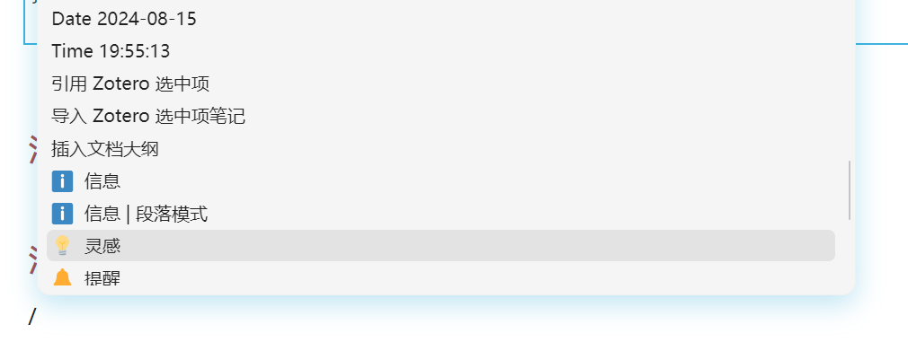
"/" commands, also known as slash commands, are commands in SiYuan that are triggered by "/" and quickly insert certain elements into the editor.
A plugin's "/" commands can be configured by setting the plugin.protyleSlash property.
protyleSlash: {
    filter: string[],
    html: string,
    id: string,
    callback(protyle: Protyle): void,
}[];
-
filter: Keywords that trigger the command.
-
html: Elements displayed in the selection panel.
-
id: Unique identifier.
-
callback: Callback function triggered after pressing Enter to select a command item.
- Generally, in the callback, elements are inserted into the editor using
protyle.insert.
- Generally, in the callback, elements are inserted into the editor using
Here is an example:
let Templates = {
    datetime: {
        filter: ['xz', 'now'],
        name: 'Now',
        template: 'yyyy-MM-dd HH:mm:ss'
    },
    date: {
        filter: ['rq', 'date', 'jt', 'today'],
        name: 'Date',
        template: 'yyyy-MM-dd'
    },
    time: {
        filter: ['sj', 'time'],
        name: 'Time',
        template: 'HH:mm:ss'
    }
};


this.protyleSlash = Object.values(Templates).map((template) => {
    return {
        filter: template.filter,
        html: `<span>${template.name} ${formatDateTime(template.template)}</span>`,
        id: template.name,
        callback: (protyle: Protyle) => {
            let strnow = formatDateTime(template.template);
            console.log(template.name, strnow);
            protyle.insert(strnow, false);
        }
    }
});
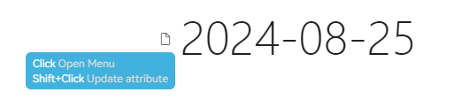
The effect is as follows:
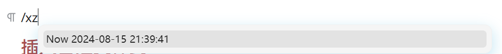
ℹ️ Tip: Generally, using slash commands is intended to insert something into the protyle. However, in some cases, we may not want to insert content but want to perform other operations, which requires us to manually clear the entered /xxx. The specific method is to insert a Lute.Carte character to clear the previous input. Here is a reference case: quick-attr plugin
protyle.insert(Lute.Carte);
Inserting Custom Styles
In most cases, you only need to write the styles in the index.css file. However, sometimes you may need to insert some custom styles using JavaScript, and you will encounter a problem: the inserted custom styles do not take effect when exporting PDF.
The simplest way to solve this problem is: the ID of the inserted style tag should start with snippetCSS to simulate a code snippet style.
For example, in the Callout plugin, all dynamically changed styles are placed within a style#snippetCSS-BqCallout, so that these dynamic styles will also take effect in the exported PDF.
Accessing SiYuan's Internal Settings
Access the window.siyuan variable; it stores a large number of SiYuan's internal settings.
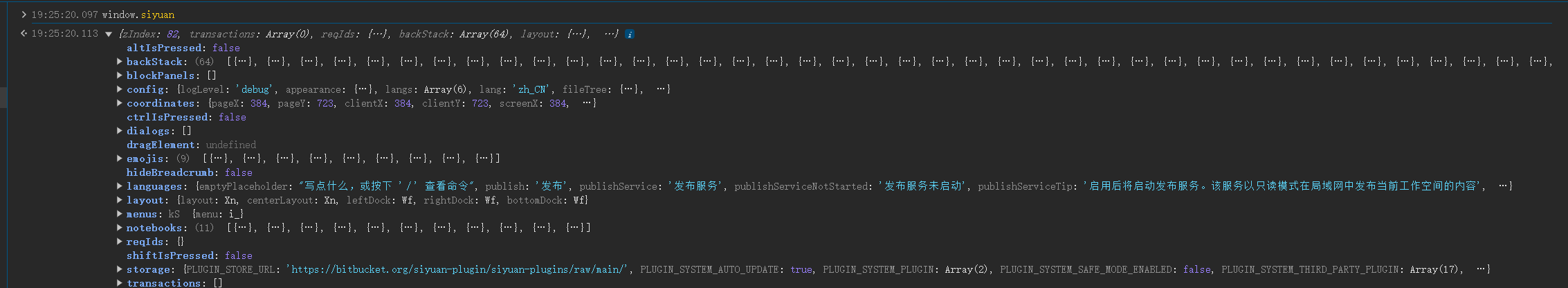
⚠️ Please use this variable in a read-only manner. Do not arbitrarily change the internal values! Otherwise, it may cause unexpected errors!
i18n (Multilingual Support)
JSON files in the i18n/ folder under the plugin directory will be automatically imported.
The plugin can access the contents through the plugin.i18n object at runtime.
If you find it troublesome, you can also handle it yourself in JavaScript; window.siyuan.config.lang points to the current language displayed by SiYuan. For example, you can do this:
const I18N = {
    zh_CN: {
        warn: '⚠️ 注意Asset目录已更改!',
        menuLabel: '同本地 Markdown 文件同步',
    },
    en_US: {
        warn: '⚠️ Warning: Asset directory has changed!',
        menuLabel: 'Sync With Local Markdown File',
    }
};

let i18n: typeof I18N.zh_CN = window.siyuan.config.lang in I18N ? I18N[window.siyuan.config.lang] : I18N.en_US;
export default i18n;
Parsing Markdown Text
There is a Lute variable under the window object, which is a tool used internally by SiYuan to handle Markdown parsing.
let lute = window.Lute.New();
lute.Md2HTML('## Hello')
// Output: '<h2>Hello</h2>\n'
Using Node/Electron API
The desktop version of SiYuan can directly access some Node environment packages and Electron APIs.
const nodeFs = window.require('fs') as typeof import('fs');
const nodePath = window.require('path') as typeof import('path');
const electron = window.require('electron');
⚠️ Never use Node.js fs to write to SiYuan's workspace!
If plugins or external extensions need to directly read or write files under the data directory, please do so by calling the Kernel API. Do not directly call fs or other Electron/Node.js APIs, as this may lead to loss of chunks during data synchronization and cause damage to cloud data.
Relevant APIs can be found under /api/file/* (e.g., /api/file/getFile, etc.).
Welcome to here!
Here we can learn from each other how to use SiYuan, give feedback and suggestions, and build SiYuan together.
Signup About