Hello!
Could you please let me know if there are any planned changes to the filter interaction interface?
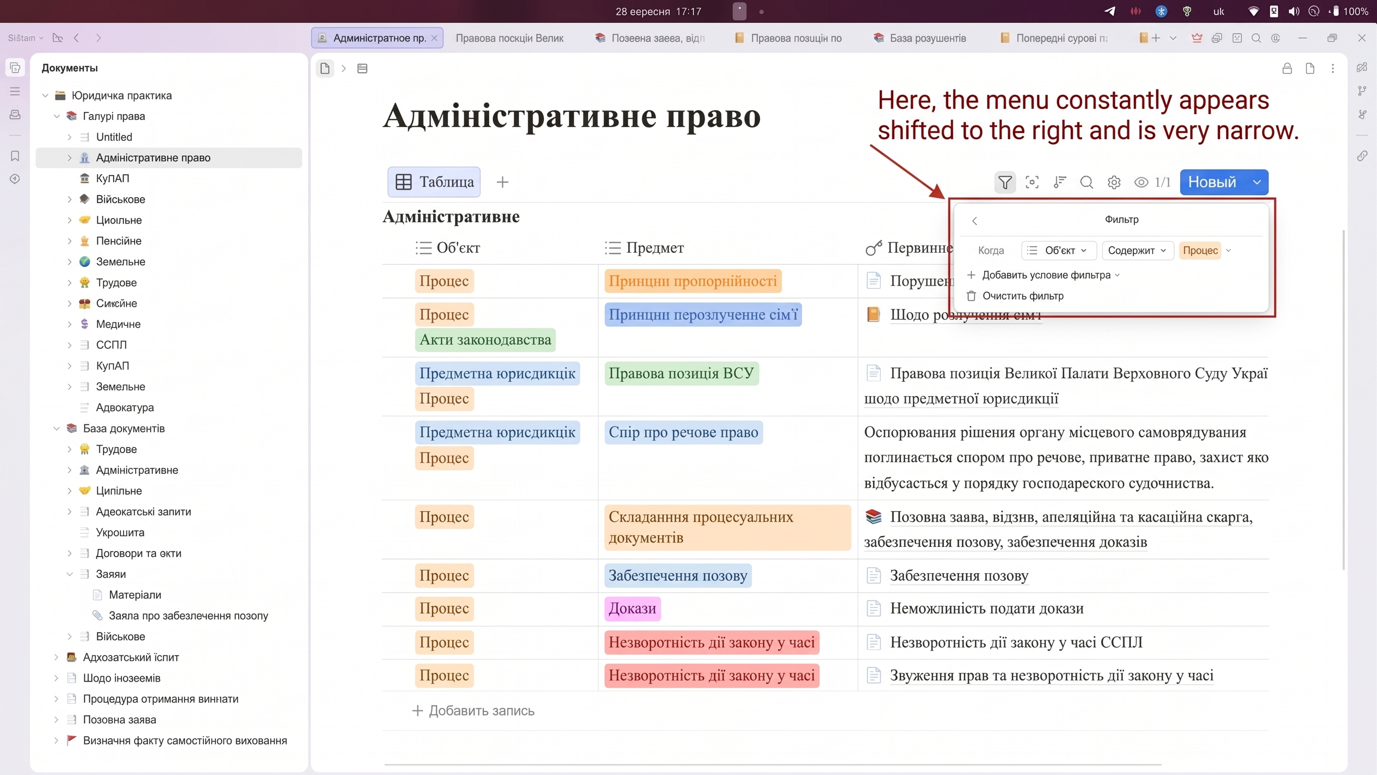
As far as I know, many users rely on a tabular view to present and store information in their notes. This allows us to classify information and easily manipulate it using the filter system. However, following the latest updates, the filter interface has changed and become very inconvenient.
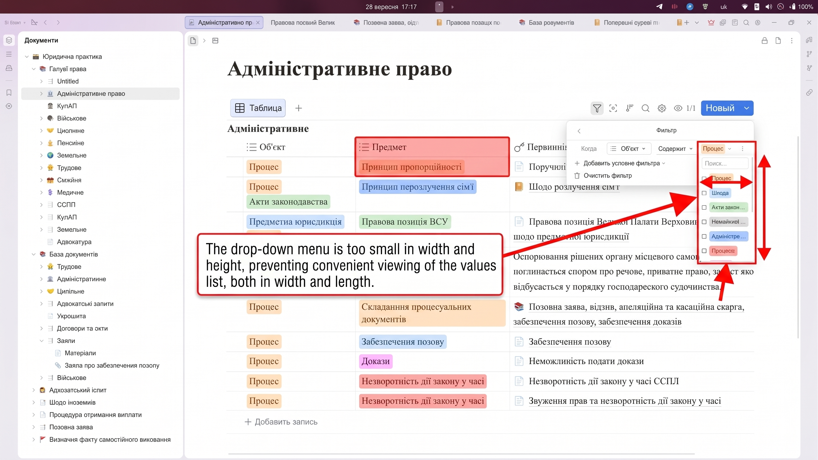
Now, the filter window has shifted to the right, becoming very small, narrow, and awkward to use. Previously, a filter dropdown appeared above each column, making the keyword list clearly visible, but now the workflow has become extremely inconvenient.
Could you please advise if there are any plans to improve or revert this interface, and if so, when exactly? These filters are a highly convenient and essential data management tool for us, making this a very pressing and important issue.
Thank you!
Best regards,
Anton
Welcome to here!
Here we can learn from each other how to use SiYuan, give feedback and suggestions, and build SiYuan together.
Signup About